One characteristic that I have noticed throughout the years about scrapbookers is their strive for perfection.
I used to strive for perfection too at one point...it was about straight lines, symmetry, evenly stamped ink, etc. However, I’ve definitely become more authentic over time and have let go of some of the pressures of making {perfect} creations.
Art and perfect do not go together. Art is about expression and feeling, nothing of which can be held to any kind of certain standard or norm. I would encourage other crafters to get out of that perfection bubble and embrace the imperfections.
Here are a few ways to embrace the imperfection...
- Photographs......We all love that perfect shot, but what about when its not-so-perfect? We can't turn the camera on fast enough, its too dark, our settings aren't right? I say, embrace it! Some of my favorite shots have emerged from poorly taken photos per typical photography standards.
- Straight lines & perfect shapes...Sometimes when you are sewing on a page or stamping along a border it doesn't come out quite straight. If it's something for a special occasion I may re-do things to get it just right, but if its just for my use or part of my scrapbooks I try to let it go. Part of this hobby is the ability to use your hands & to me its the natural part of creating that comes through when things aren't so perfect. In fact, I tend to prefer naturally cut flower petals over the die-cut ones anyday.
- Album displays.....Its understandable to want the presentation of this hobby to be aesthetically pleasing for others to see, but what happens when you have a different type of page protector that you can't fill in on the reverse side? I just let it go and put it in my album chronologically with the others. Sometimes I get lucky and the front & back sides of layouts just work out, but if not I don't sweat it. If you really can't deal with the blank back you can just fill in with patterned paper or binder clip another blank back layout facing the other way together with the blank sides facing inward to conceal.
- Smudges, smears, splatters & other unfortunate events...It happens! You spend time stamping carefully, writing carefully, then when you move your paper or add a little something the side of your hand catches your fresh ink and causes a smeary mess! No worries. Again the human, hand-made element shows through our projects. I don't always use handwritten journaling, but I have always loved the original nature of handwriting and prefer to see it trapped in time on my pages, no matter how neat or messy it may be.
- Mis-judging, mis-measuring...We simply are just not perfect beings. Our eyes play tricks on us or our printers have minds of their own! If you don't get it quite the right size or quite the right alignment will anyone notice? More importantly, will anyone care? Its about the stories...the photos & words that keep track of these precious moments from our lives.
Here are some examples of imperfections I have come to love...
 |
| The photo on the right is quite blurry as my nephew zips by...However its the end of a series of about 5 photos of him running down the hallway. I love the look of these shots, his small frame in the hallway running by at lightening speed. I love that I can see his activity because he is quite active! |
 |
| In this pic of the Eiffel Tower, I increased ISO and slowed the shutter speed, when I hit the shutter I slowly rotated the camera to get this motion effect. Its a neat trick you can try with nighttime photos where bright lights are present. |
 |
| Handwriting...Not always the neatest but tells the story all the same. |
 |
| After stamping the {Blah Blah Blah} stamp, I filled in some journaling which smudged on the bottom. But I like the messiness, sorta adds to the idea of the moment as well. |
 |
My chronological album showing a blank back of a layout! Yikes! |
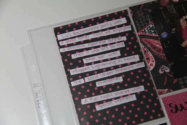 |
| In this instance I estimated the width of my journaling to print out. When I did print it, it was a little to wide to actually fit within the 4" frame, so I decided to cut the lines out and reposition the wording to fit accordingly. In the end, I like the playful look of the lines and think its actually better than seeing a larger white background of the text. |
Embrace the imperfections & just Be.


No comments:
Post a Comment